The first time I spent a full afternoon with car advertisements 1920s, I expected machinery and got theater instead. There were proud families in front of broad-shouldered sedans, country roads that looked suspiciously free of mud, and copy promising that a new automobile would improve nearly every part of a person's life. The cars were important, but the dream surrounding them was the real product.
For anyone who likes vintage clothing, furniture, or graphic design, these ads are a wonderful archive. They show what people wore, how homes were pictured, which words sounded modern, and how manufacturers turned steel, leather, and gasoline into an identity. Every stitch has a story, and every advertisement does too.
Why car advertisements 1920s feel so different
The decade sat between two worlds. Cars were becoming more common, but they were still expensive purchases that required explanation. An advertisement could not assume that every reader understood horsepower, body styles, or maintenance. It had to teach, reassure, and flatter the buyer at the same time.
That is why car advertisements 1920s often read less like a quick modern promotion and more like a short sales letter. A manufacturer might explain the engine, describe the upholstery, praise the brakes, and then suggest that the vehicle would make a family more comfortable or a business more successful. Mechanical details mattered, but social usefulness mattered just as much.
Ford advertisements tended to emphasize dependable production and accessible transportation, especially around the Model T. Other makers presented their cars as more refined, more powerful, or more carefully finished. Packard, Buick, Cadillac, Studebaker, and Chrysler each worked to occupy a different rung of the market. The language tells you where the company believed its buyer belonged.
The visual grammar is just as revealing. Many ads used engraved illustrations, formal lettering, dark borders, and carefully posed scenes. A sedan parked outside a large house was not merely a sedan. It was proof that the buyer had arrived somewhere.
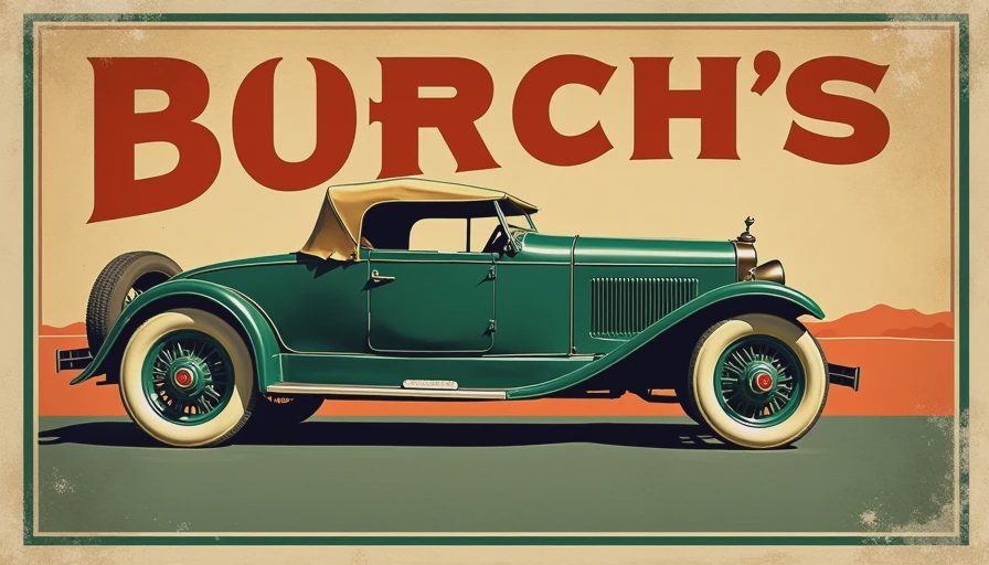
How to read the design of a 1920s automobile ad
Start with the people before studying the car. Their clothes, posture, and surroundings often reveal the intended customer more clearly than the headline. A driving coat, cloche hat, tailored suit, or long skirt can turn a basic product image into a small piece of social history. Notice whether the driver is shown working, traveling, visiting, or simply being admired. Each setting carries a different promise.
Then look at the automobile itself. Body shapes changed quickly during the decade, and advertisements help track that shift. Early examples can feel upright and carriage-like, while later images show lower profiles, enclosed cabins, brighter finishes, and more confident styling. A touring car suggested open-air freedom. A closed sedan suggested weather protection and respectability. A roadster carried a more youthful, sporting attitude.
The headline is usually less clever than a modern slogan, but that is part of its charm. Words such as “quality,” “comfort,” “service,” “value,” and “performance” appear repeatedly because they addressed the buyer's anxiety. A new car was a serious financial decision. The ad needed to make unfamiliar technology feel dependable.
When comparing car advertisements 1920s, pay attention to the amount of text. A dense page often signals that the manufacturer was selling engineering or value. A more spacious composition, especially in an upscale publication, might be selling elegance and status. Neither approach is accidental. Layout was part of the pitch.
The stories manufacturers sold
The strongest car advertisements 1920s rarely sold transportation alone. They sold independence, family convenience, professional credibility, and access to a wider country. A vehicle could take a household beyond the streetcar line, help a salesperson cover territory, or make a weekend trip possible without a train schedule.
This is where the decade's optimism becomes especially visible. Roads were improving in many places, service stations were spreading, and manufacturers were learning how to speak to a growing audience. The automobile represented movement, but also control over one's time. That promise remains familiar in modern advertising, even if the images now arrive through a phone instead of a magazine.
Luxury brands leaned into craftsmanship and quiet authority. Their advertisements gave space to polished interiors, handsome coachwork, and formal settings. Mass-market brands leaned toward practicality and ownership value. The difference resembles vintage clothing labels: one maker wants you to admire the fabric and finishing, while another wants you to trust the garment to work every day.
Some ads also reveal the era's assumptions about who belonged behind the wheel. The driver is frequently presented as a confident man, while women may appear as passengers or symbols of domestic comfort. That pattern is not a complete picture of real driving life, but it is an important record of how advertisers framed it.
A collector's guide to finding useful examples
If you are hunting for car advertisements 1920s in old magazines, begin with publication context. A general-interest magazine may offer a broad, family-focused ad, while a trade publication can contain more technical language and dealer information. Sunday newspaper supplements, automobile journals, and illustrated magazines are all worth checking at estate sales and paper fairs.
Condition matters, but a clean page is not automatically the best page. Look for complete headlines, readable model names, intact color, and enough surrounding publication information to establish a date. A torn ad with a clear dealer imprint can be more useful than a perfect page stripped from its original context.
Prices range widely. Common loose pages can sell for a few dollars, while scarce color plates, early luxury-car material, or complete period issues can reach several dozen dollars or more. I have overpaid for a beautiful print simply because the border looked good under shop lighting. The lesson was painful and straightforward: check the paper, source, and demand before falling in love.
For display, use archival sleeves and avoid direct sunlight. Cheap tape, acidic backing, and a damp frame can undo a century of survival in a few months. If the paper is brittle, scan it rather than flattening it aggressively.
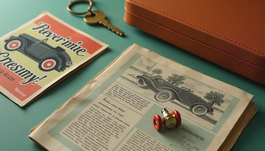
What these ads can teach a vintage wardrobe
Car advertisements 1920s are useful even when you are not collecting automotive paper. Their styling helps build a believable period outfit without turning it into a costume. Study the relationship between the car, the clothing, and the setting. A driver beside a formal sedan might wear a structured overcoat and polished shoes, while a roadside scene calls for sturdier outerwear and practical layers.
The colors are helpful too. Muted cream, charcoal, oxblood, forest green, and tobacco brown appear naturally in many surviving illustrations and photographs. You do not need to copy every detail. A high-waisted trouser, a substantial wool coat, or a simple leather shoe can borrow the era's proportion without pretending you have stepped out of a silent film.
Pay attention to accessories that make the scene believable: gloves, a narrow tie, a brimmed hat, a compact leather case, or a plain scarf. One period-minded detail is usually stronger than six loud ones. The goal is to understand the visual language, not recite it at full volume.
A simple method for studying any ad
Take a photograph or scan and write down five observations. Record the manufacturer and model, the likely publication date, the intended buyer, the main emotional promise, and the physical details that support that promise. Then compare the page with another maker from the same year.
This process turns browsing into research. You begin to see why one company used a grand home while another used a muddy road, or why one ad devoted half its space to engine details while another barely named the motor. The differences are the history.
Car advertisements 1920s also reward slow looking. Read the small print. Inspect the lettering. Notice the expressions, the furniture, the road surface, and the way the car is positioned in the frame. A tiny detail can reveal more than the headline. Every stitch has a story, and every period advertisement is stitched together from those details.
If you find a promising page at a flea market, do not rush past it because you are not a car expert. You can still read the design, date the mood, and connect the image to clothing and material culture. That is the pleasure of the archive: it gives you more than one way in.




No letters yet — be the first to write.